THE PROBLEM
Wanderlust + Co is a trendy and affordable jewelry label E-commerce site, but its design appears outdated compared to its competitors and part of its user experience is unpolished. An overhaul is overdue and will ensure Wanderlust + Co remains competitive in the long haul.
THE SOLUTION
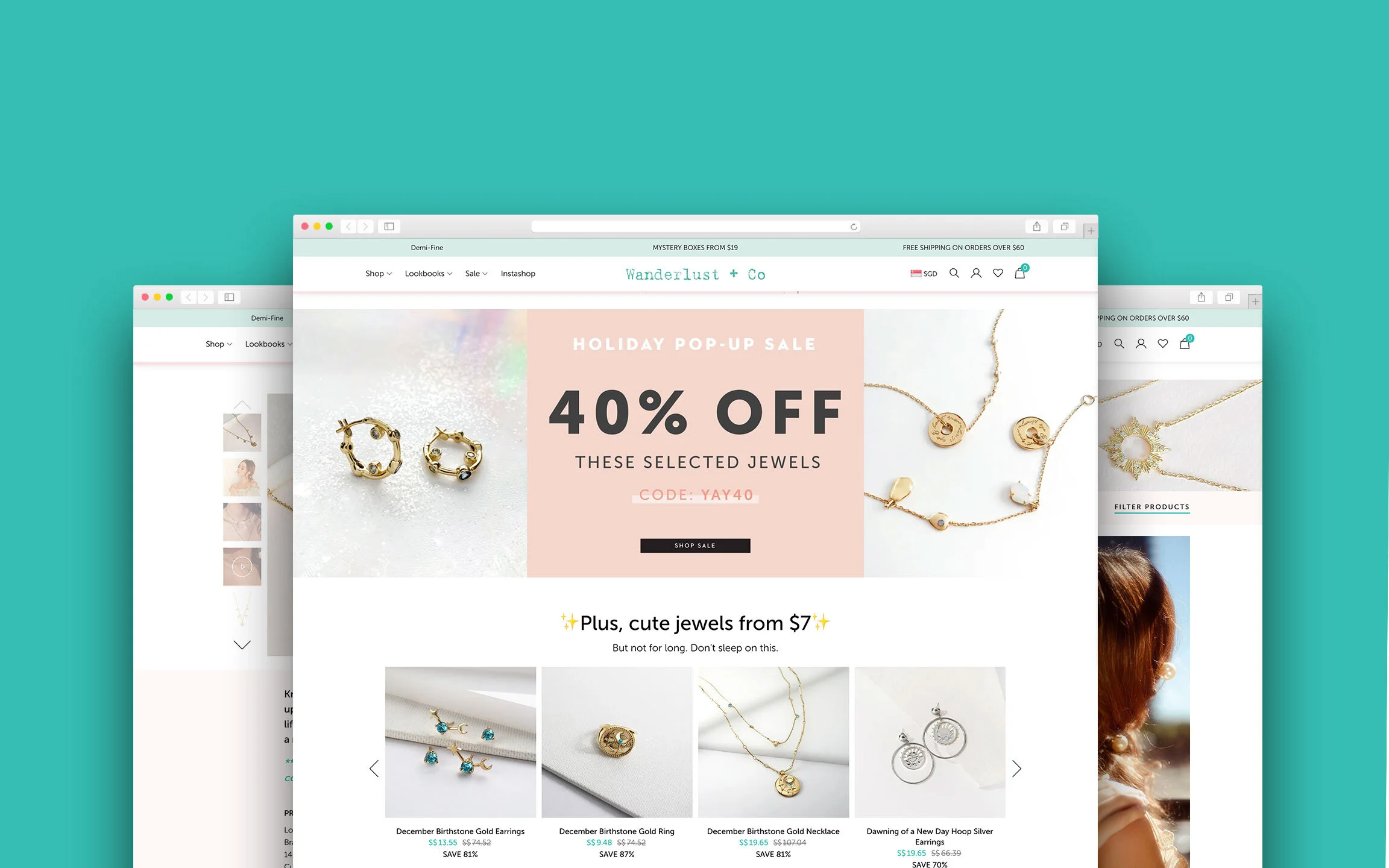
We set out to create a brand-new website to ensure Wanderlust + Co encompasses best-in-class usability and aesthetics across all corners of the website.
MY ROLE
I led the project and worked on all aspects of the redesigned site, including its research, visual and UX. I also revamped the UI/UX of key pages while my developer colleagues helped to implement my designs.
ROLES
UI/UX Designer
RESPONSIBILITIES
Research
Competitor Analysis
Information Architecture
Sketches
Wireframes
Interface Design
PLATFORM
Web/Ecommerce
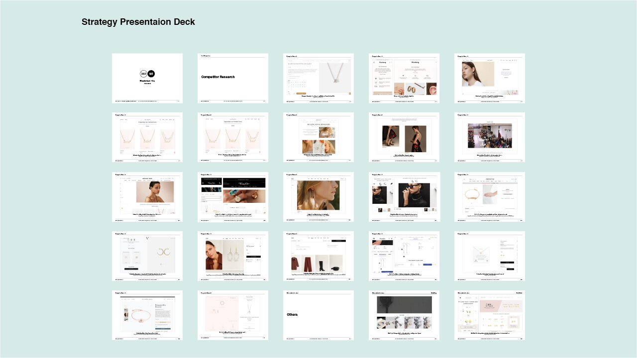
Brainstorming and kicking things off with a solid strategy.
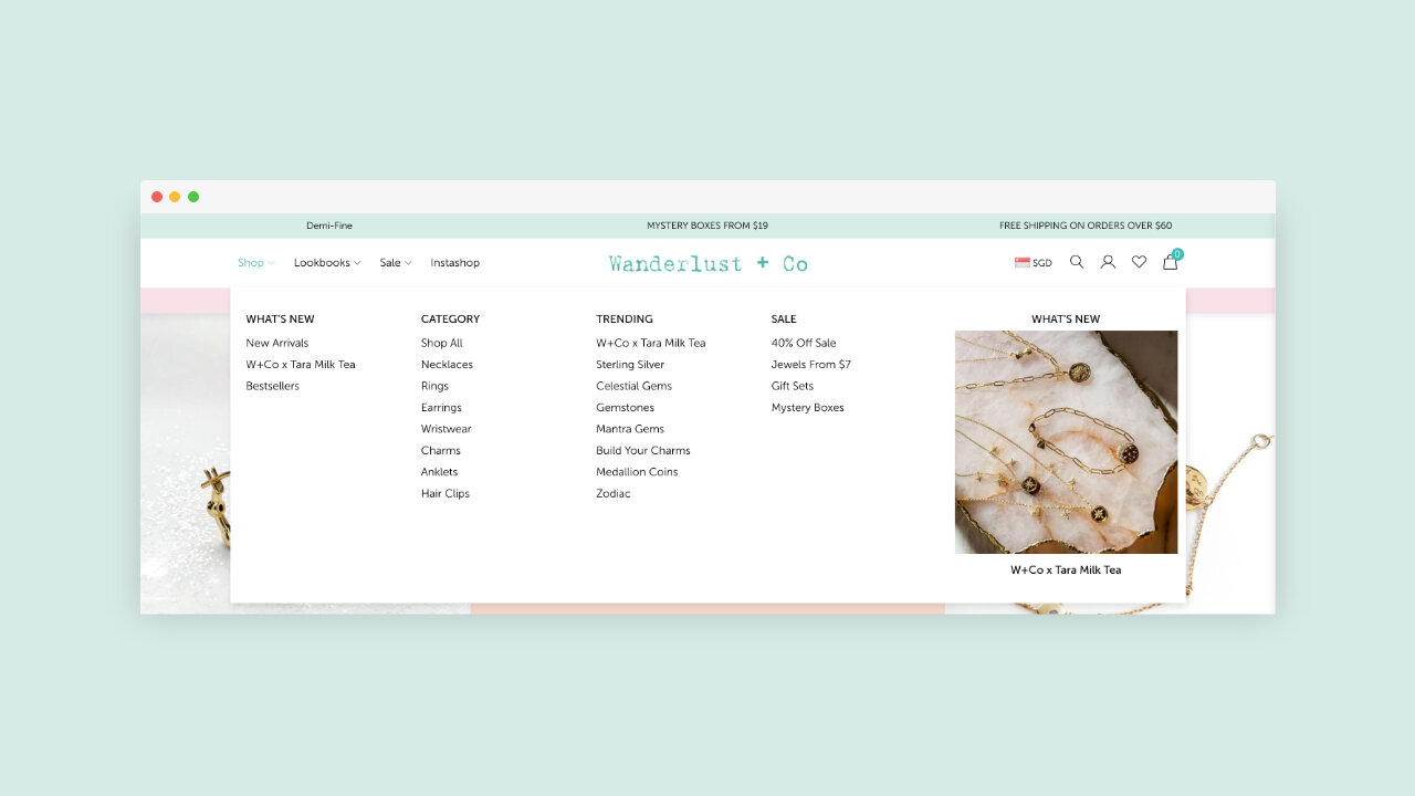
We worked closely with the Wanderlust + Co leadership and marketing team to plan and develop a strategy which, we then applied these to a new navigation structure and information architecture.
Understanding the user.
Wanderlust + Co is a female-led community. It’s the haven for women who seeks inspiration and to have a growth mindset. To understand the needs of these customers, we created unique user personas to represent the range of customers. This then painted a clear picture of their demographics, psychographics, needs and wants.

User Persona
A persona representing real users helped us to focus on user goals and needs. We were able to better understand the world of our user to come up with a definitive problem and a solution.

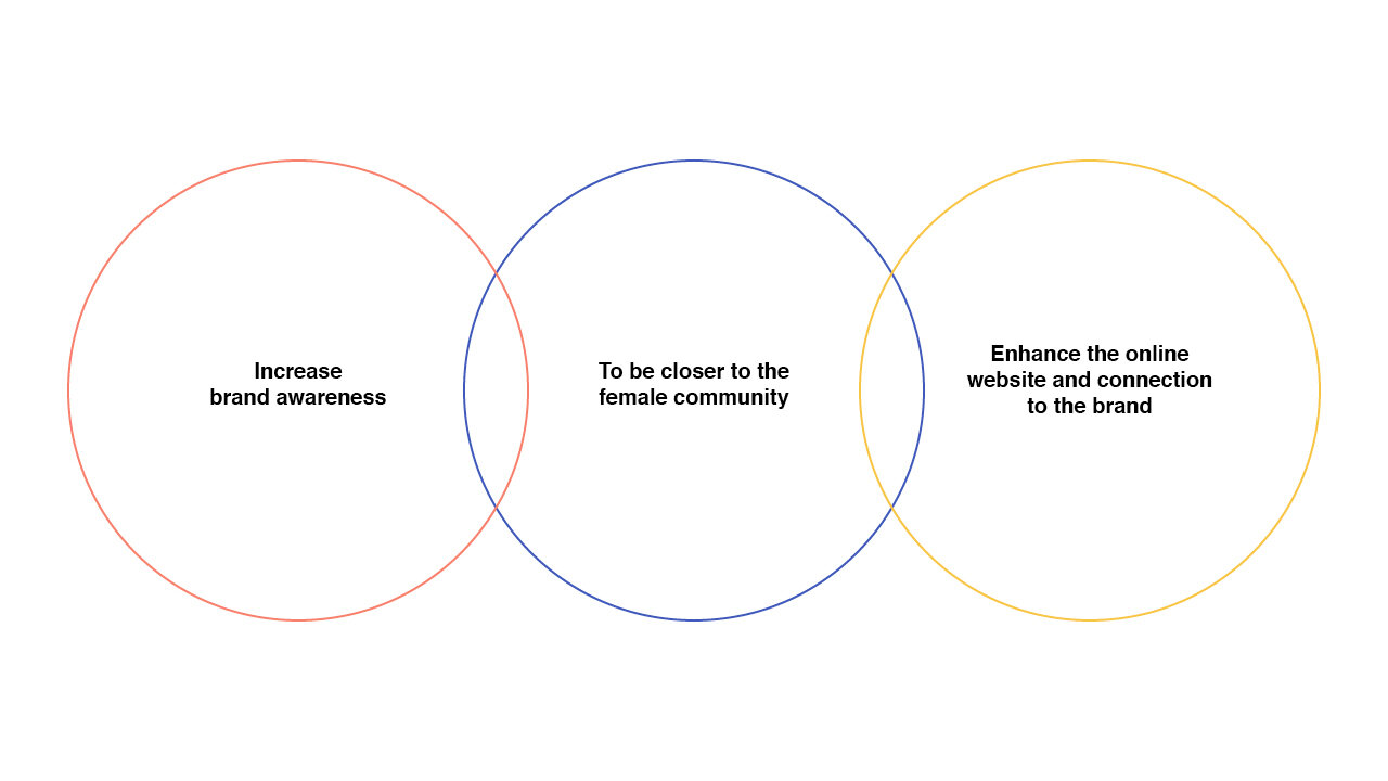
Design Objectives
Once we understood user behaviours, we defined the project scope based on market-driven results.
Defining The Brand
After a series of brainstorming and discussion in the strategy session, we concluded the key pillars of the brand. This defined the brand’s personality: how it should look, sound, and act.

Brand Positioning
Understanding what the Wanderlust + Co brand is and who they are championing for helped define the positioning statement of the brand. This sets the tone for everything created for the brand.

Information Architecture
To ensure that the website structure matches the user thinking, a couple of user group testing was done with the user to group items into predetermined categories. Attention was paid to guiding users throughout the website and connecting them to pertinent tools within various content sections. This helped us to form a sitemap for the website displaying the layout of the categories on the homepage.

Sketches
Some early sketches showing the types and how the contents are being displayed to create and optimise the Wanderlust and Co user experience.

Wireframing
To improve the overall experience of the process in looking for a jewellery, accessible navigation and search system will show up at all times, filtered by Category and Colour. The user can discover new jewellery by browsing through similar styles, which improves the user experience and allow them to ultimately create their own favourite list.

Visual Design (Style Guide)
We adhered to Wanderlust and Co branding standards while expanding a little for them in the digital environment. Our focus for the visual design was to enhance the functionality while retaining their brand positioning. A minimal primary colour palette and thoughtful use of secondary colours throughout the website served to assist the user in navigating the website and provide visual cues for different types of content.

We emulated the look and feel of Wanderlust and Co by using the brand’s colours, focusing on clean and seamless interface, focusing on the key product: The jewellery.
Final Design
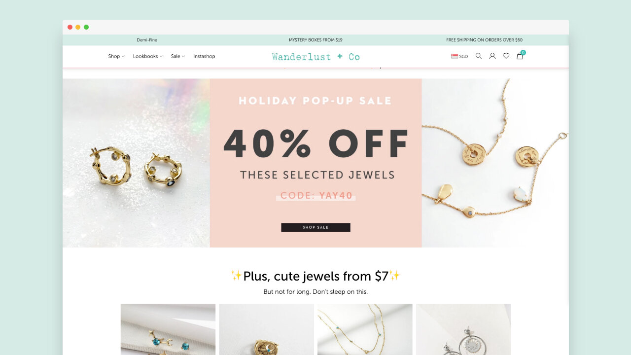
After several rounds of user testing on the wireframes, we created the final design of the website and develop it. The final design is a simple, easy to navigate around the website. We were able to strike a nice balance between driving sales, helping user browse and explore the beauty of the jewellery that they are interested in. Thus, we were able to improve their experience shopping online at Wanderlust and Co.

Mobile Minded Design
A significant percentage of Wanderlust and Co traffic consist of users on mobile devices. One of our primary goals was to craft the user interface design to be modular achieving perfect responsiveness, regardless of the screen size.


Credits
CLIENT
Wanderlust + Co
CLIENT FOUNDER
Jenn Low
DESIGN AGENCY
360 & 5
DESIGN DIRECTOR
Andrew Lim
SENIOR DESIGNER
Beiwen Wong
DESIGNER
Andy Ng
LEAD DEVELOPER
JJ Tan
DEVELOPER
Aishah
BACKEND DEVELOPER
Syabil
