THE PROBLEM
ONE Championship is widely considered to be the largest global sports media property on the continent. Their user experience for the online store is unpolished, resulting in a high exit rate and cart abandonment.
THE SOLUTION
To redesign the user experience and interface to ensure that it helps to increase conversation rates while encompassing best-in-class usability and aesthetics across all corners of the site.
THE ROLE
I am responsible for the user research and experience design for this project. Beiwen, a fellow UI designer, assists with crafting the aesthetics and design of this project.
ROLES
User Researcher
UX Designer
RESPONSIBILITIES
Research
Taxonomy sitemap
Sketches
Wireframes
PLATFORM
Web/Ecommerce
Kickoff strategy and landscape analysis
We worked closely with the stakeholders and leadership team to develop a strategy based on the landscape analysis. The main purpose is to make sure that we establish the goals of this project.

Unique ONE Championship UX challenge
Every great digital product strikes a fine balance between business goals and user needs. ONE Championship e-commerce website was no different. While the overarching business goal was to make it easier for users to add to cart and checkout, there were several user goals that needed to be addressed and accomplished. We were able to strike a nice balance between driving sales, helping users get engage with the community and get latest updates.

Understanding the user personas
MMA is a widely renowned social sport and activity. Both fighters and fans tend to actively engage and communicate with each other within the MMA community. To better comprehend the needs of the fans, we have created unique user personas to represent the variety of users who have helped us to focus specifically on the user needs. Through this research, we've proposed various sections to boost traction and enticement for users to explore the site.


Building the taxonomy
To build a future-proof inventory, we payed close attention to the taxonomy of the sitemap where we drew inspiration from e-commerce giants. This allowed us to form a good taxonomy to facilitate the browsing experience for users.

Sketches and Lo-fidelity wire-framing
Some early sketches shows different versions of how content is being displayed to establish and optimise the One Championship user experience
Version 1 – Events:
This concept would focus mainly on fights. The hero banner would promote upcoming fights and there will be sections to help users browse ONE FC essentials or merchandise from specific fighters. This helps to keep the site updated and give users visiting the main site a sense of familiarity. This concept also thrives a lot on what’s trending within their community and this keeps engagement with their audiences.

Version 2 – Products:
While both concepts would have sections to promote their products, this version focuses on displaying recommended shopping categorisations. This helps to guide users into exploring their products and promoting new collections. This option was also less strenuous for the client to upkeep since it requires lesser updates.


Brand and style guide
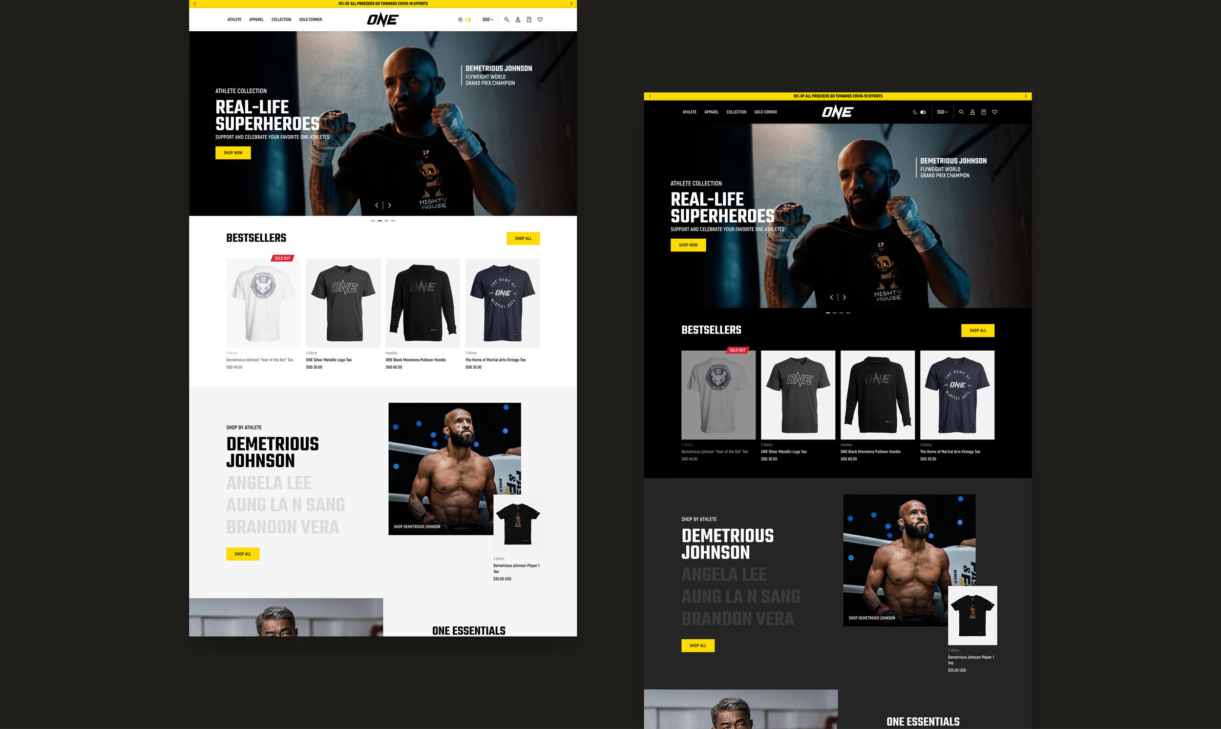
The focus for the visual design was to enhance the functionality while retaining their brand positioning. A minimal primary colour palette and profound use of secondary colours throughout the website was utilised to assist the user in navigating the website while providing visual cues for different types of content.


Final look
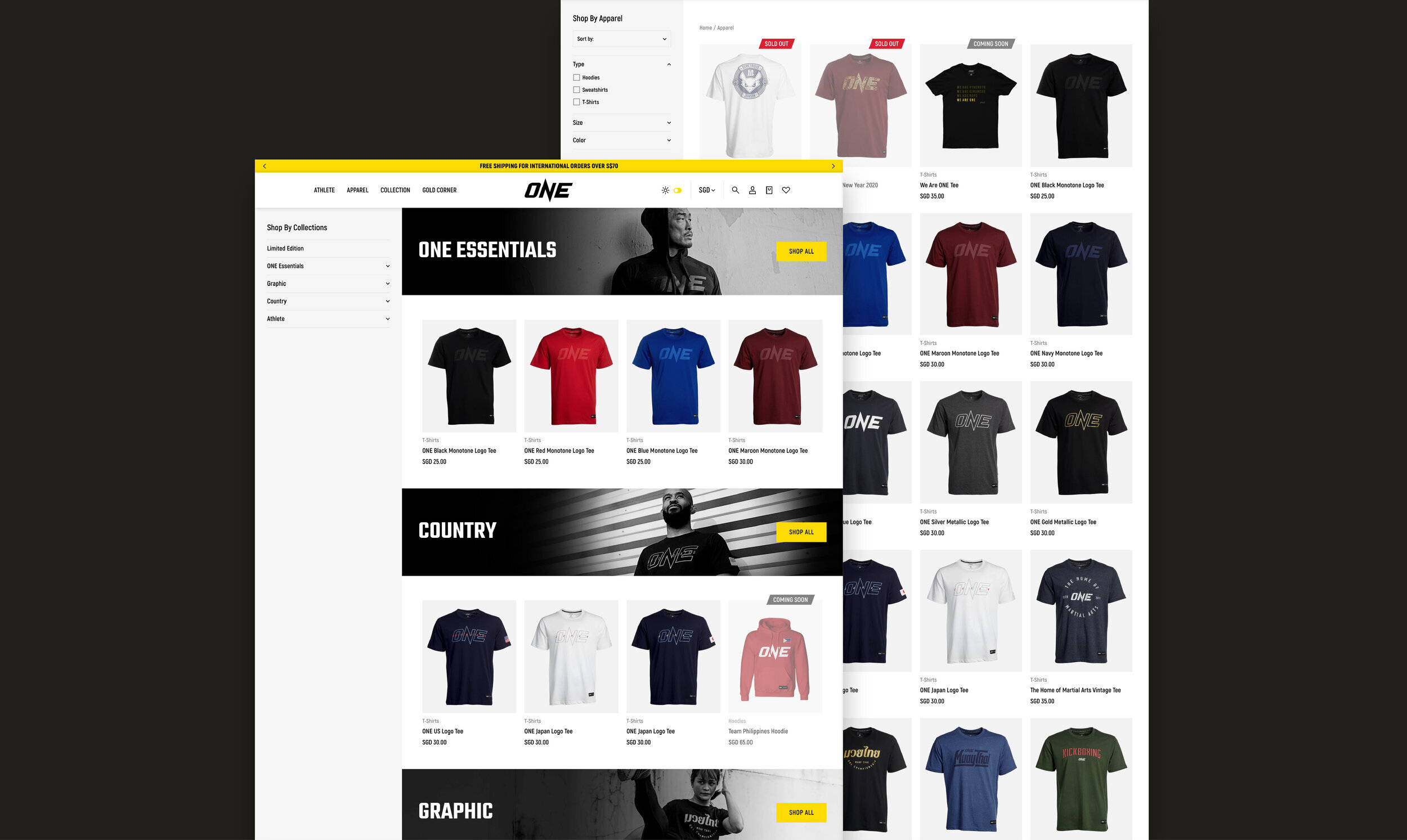
After several rounds of user testing on the wireframes, we created the final design of the website and developed it. We were able to strike a nice balance between boosting sales, enhancing the user experience and assisting the user's search for merchandise of interest. Thus, we were able to improve their overall experience for online shopping at One Championship.

Results — One Championship online sales grew by 20x
One Championship’s online sales grew by 20-25 times. The upsell and free shipping automation had also resulted in bigger cart sizes from its customer base, which has grown as a whole by five times.
One Championship used to rely heavily on event merchandise sales until COVID-19 hit in 2020 made this impossible. However, instead of merchandise sales dropping due to the lack of live event, One Championship saw the online sales increase from 20% of overall sales to 99%. Overall, sales were lifted by 3 to 4 times.
Its online experience now takes care of the consumer journey, reducing the obstacles in the path, and create a seamless and pleasant experience to purchase.
Credits
CLIENT
ONE Championship
CLIENT FOUNDER
Chatri Sityodtong
DESIGN AGENCY
360 & 5
DESIGN DIRECTOR
Andrew Lim
SENIOR DESIGNER
Beiwen Wong
UX DESIGNER
Andy Ng
INTERACTION DIRECTOR
JJ Tan
DEVELOPER
Marc Lim
BACKEND DEVELOPER
Syabil


